
Others
Web-Safe Fonts for Your Next Design Project [Infographic]

Mar
Here’s a great article from WebFX Blog
Whether you notice or not, you encounter tons of fonts every day — on billboards you pass by on your drive to work, on your smartphone screen, on websites, on pizza boxes, and so many other places you may not even realize.
There are over 300,000 fonts in the world, and the number grows every year.
Fonts give designers the opportunity to create designs and messages that fit nearly any style or brand — and they can evoke different feelings in consumers. For example, script fonts create a sense of class and formality, while graffiti style fonts reflect a sense of freedom.
Web-safe fonts for your next digital project
This infographic outlines four main classes of fonts, their histories, and common uses. In addition, we noted the web-safe fonts.
What is a web-safe font? Every computer comes pre-loaded with a list of fonts. This means that if you use that font on your website, every user will be able to see it. However, if you use a font that you pay for, or add to your computer, not every user will be able to see it — rather they’ll see a very basic font in its place.
Looking for some creative web-safe fonts for your next design project? We’ve got them labeled for you!
Keep in mind though that the web-safe fonts in this post are only a fraction of the entire list of web-safe fonts.
Ready to learn more? Check out our infographic below!
1. Serif fonts
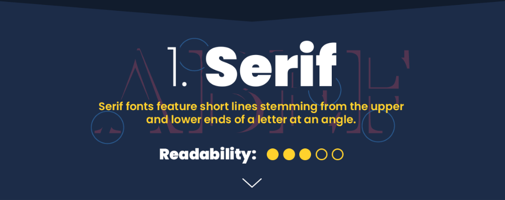
Serif fonts feature short lines stemming from the upper and lower ends of letters at an angle. Readability of Serif fonts varies, but overall, the readability is mediocre.
Old Style
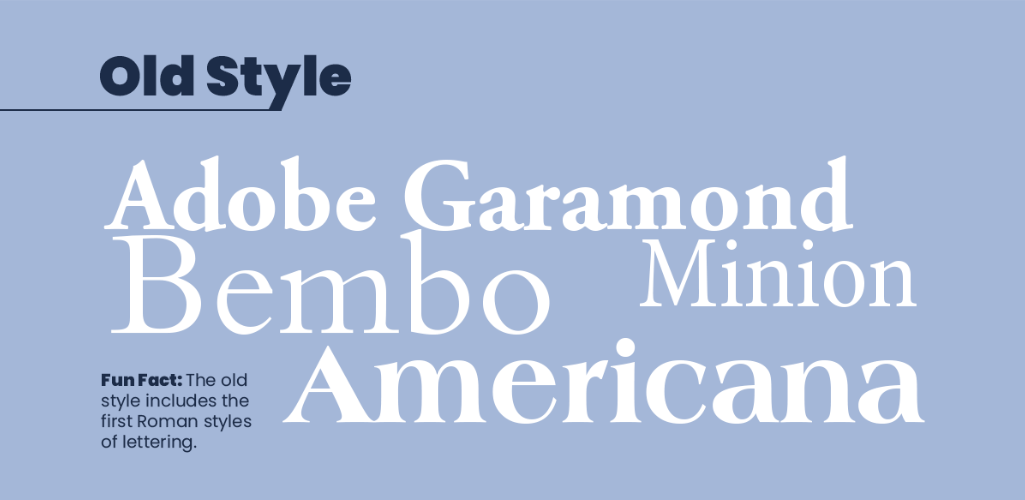
Old Style was developed by typographers of the Renaissance back in the 15th century. As you can see in the examples, many of the letters used in the Old Style are loosely based on strokes drawn by a pen.
This font is also characterized by its wedge-shaped serifs and lack of contrast between thick and thin strokes.
Fonts in this class include:
- Adobe
- Garamond – web-safe
- Bembo
- Minion
- Americana
Neoclassical and Didone
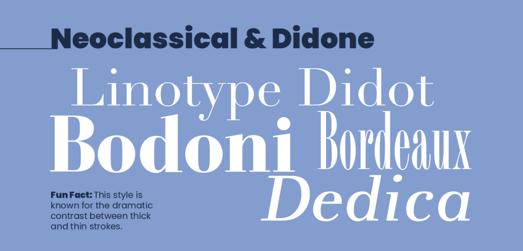
These two typefaces are so similar, they’re typically classified as one. The fonts in this style are known for their dramatic contrast between thick and thin strokes.
At first, these fonts were named “classic” fonts, but printers changed the name when they realized they were not simply updates of classic fonts, but entirely new styles.
Fonts in this class include:
- Linotype
- Didot – web-safe
- Bodoni – web-safe
- Bordeaux
- Dedica
Transitional
![]()
The transitional style is known as such since it is thought of as the transition between Old Style and Neoclassical fonts in the mid-18th century. The style was created by printer John Baskerville.
Fonts in this class include:
- Franklin Gothic – web-safe
- Freight Sans
- Perpetua – web-safe
- Baskerville – web-safe
Slab
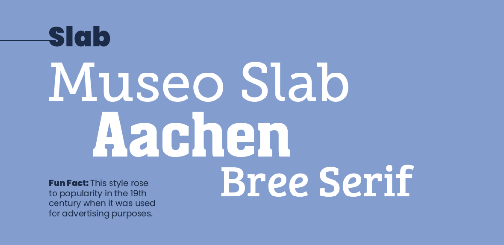
The Slab typeface rose to popularity in the 19th-century when it was used for advertising purposes. It’s fairly easy to read and makes headlines pop since the letter weight has virtually no contrast.
Fonts in this class include:
- Museo
- Slab
- Aachen
- Bree Serif
Clarendon
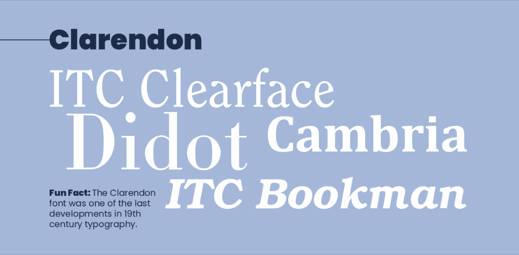
This class of fonts is known as one of the last developments in 19th-century typography — and what a great development it was! There is only a slight contrast in weight across strokes and the serifs are relatively short.
In later years, these fonts were used in larger point sizes in display applications.
Fonts in this class include:
- ITC Clearface
- Didot
- Cambria – web-safe
- ITC Bookman – web-safe
Glyphic
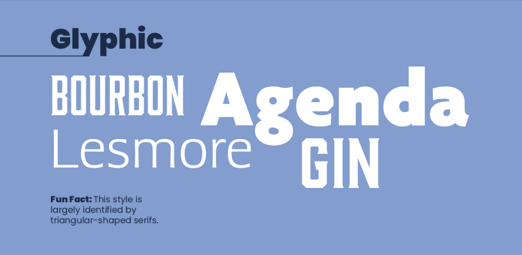
Glyphic typefaces are largely identified by their triangular-shaped serifs.
Fonts in this class include:
- Bourbon
- Agenda
- Lesmore
- Gin
2. Sans Serif fonts
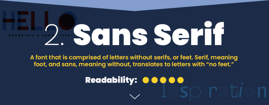
Sans Serif fonts have letters without serifs, or feet. Serif means foot, and sans means without — so together, they create the meaning “no feet.” This is typically thought of as the most readable class of fonts.
Grotesque
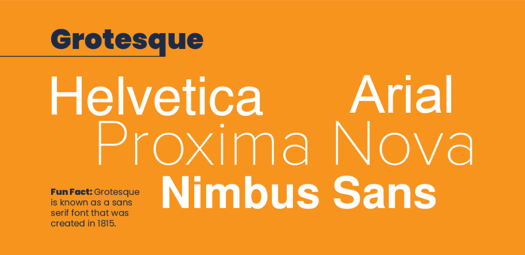
Grotesque typeface was created in 1815. It has obviously stood the test of time, since the fonts in the group are some of the most popular, even today.
Letters have a somewhat square quality, and the letters have less contrast in strokes when compared to other styles.
Fonts in this class include:
- Helvetica – web-safe
- Arial – web-safe
- Proxima Nova
- Nimbus Sans
Square
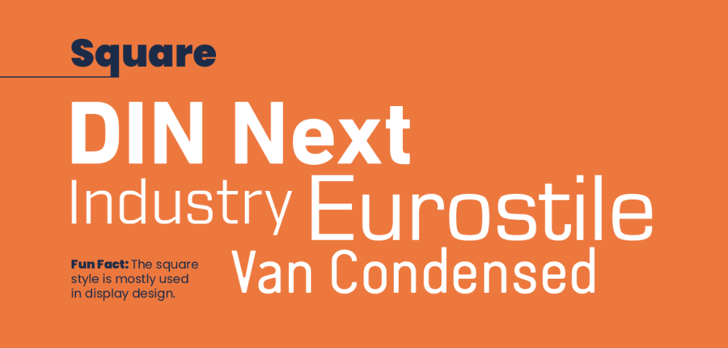
Square type is mostly used in display design, since its angular style lends itself well to graphic design. The group got its name since most of the curves are more of a square than a semi-circle.
Fonts in this class include:
- DIN Next
- Industry
- Eurostile
- Van Condensed
Humanistic
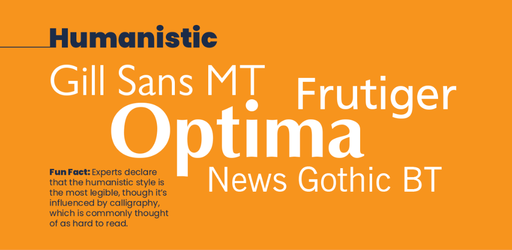
Experts declare that the humanistic style is the most legible. However, it’s influenced by calligraphy, which is commonly thought of as hard to read. You can make the call for yourself!
Fonts in this class include:
- Gill Sans MT – web-safe
- Frutiger
- Optima – web-safe
- News Gothic BT
Geometric
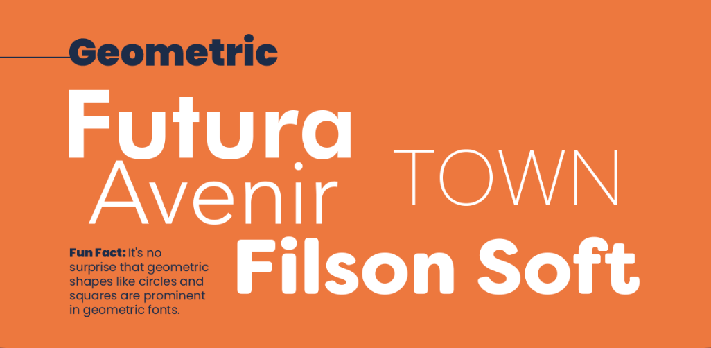
It’s no surprise that the Geometric style is highly influenced by geometric shapes like circles and squares. In terms of readability, the Geometric style is less readable than many other styles.
Fonts in this class include:
- Futura – web-safe
- Avenir
- Town
- Filson Soft
3. Script fonts
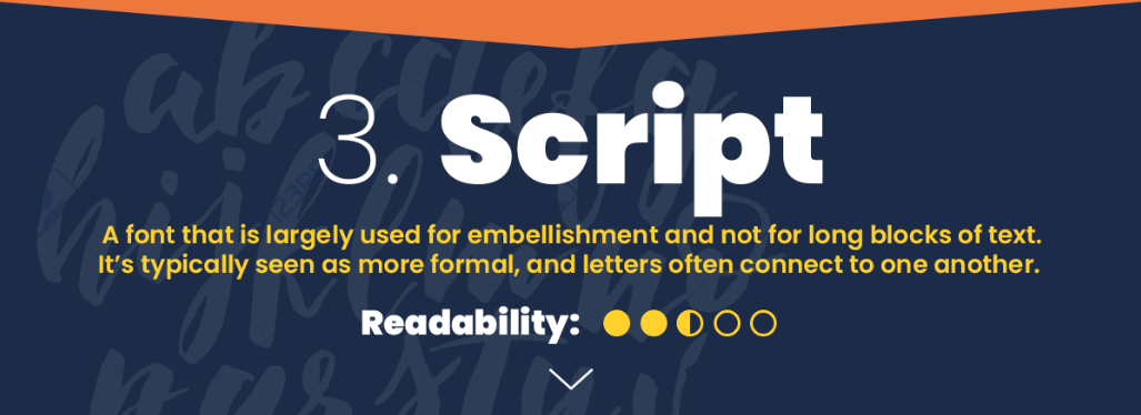
Script fonts are largely used for embellishments and not for long blocks of text. Typically seen as more formal, the letters in script fonts often connect to one another. Though these styles are super elegant, they’re not always easy to read.
Formal
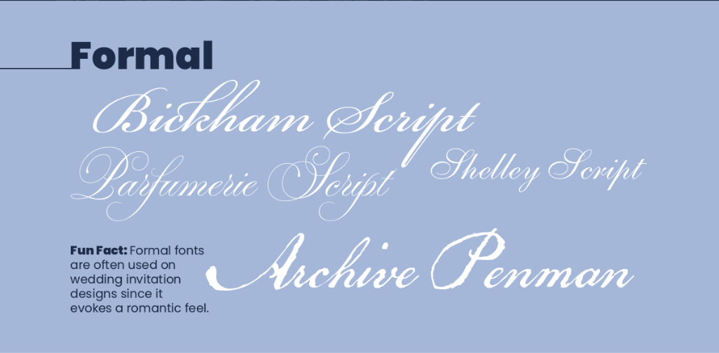
Fonts in the Formal style are often used on wedding invitation designs since they evoke a romantic feel. They’re typically light-weight and the letters have curly ends. Since there is so much embellishment in Formal fonts, they are typically harder to read than other styles.
Fonts in this class include:
- Bickham Script
- Parfumerie Script
- Shelley Script
- Archive Penman
Casual
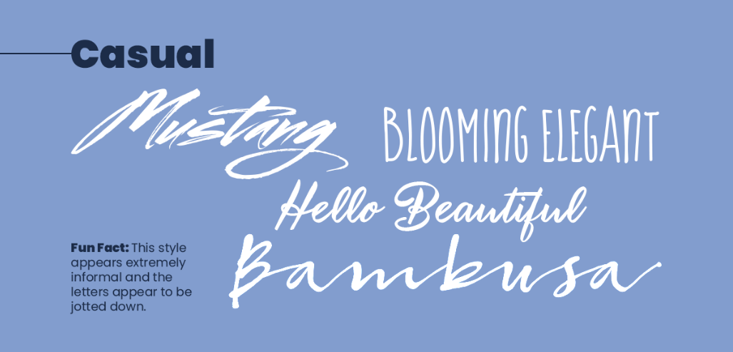
The Casual style appears extremely informal and the letters look like they’ve been jotted down. They evoke a feeling of rushed penmanship and have very different qualities from font to font. Because of their somewhat careless style, these fonts can be hard to read.
Fonts in this class include:
- Mustang
- Blooming Elegant
- Hello Beautiful
- Bambusa
Calligraphic
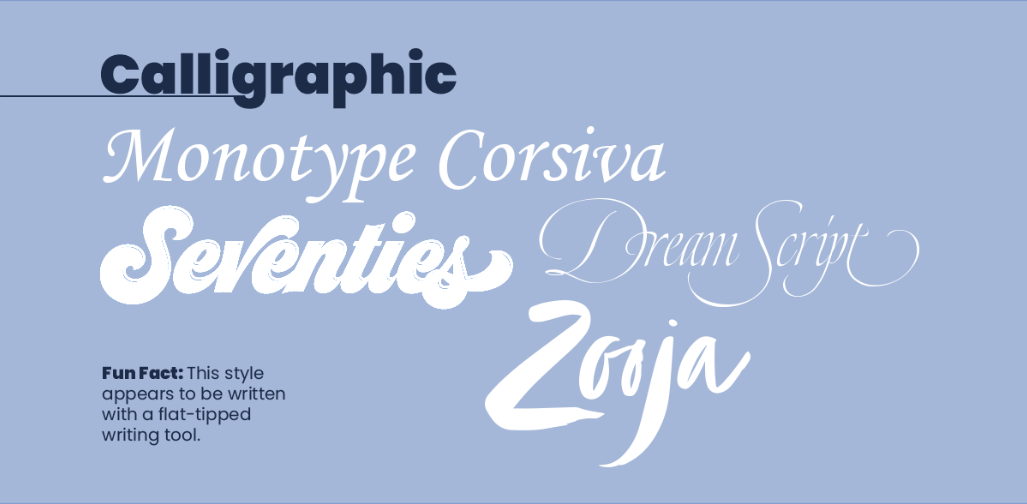
This long-standing style of type appears to be written with a flat-tipped writing tool. Some characters are connected together, while others are not. This can cause readability issues when the letters run together.
Fonts in this class include:
- Monotype Corsiva
- Seventies
- Dream Script
- Zooja
Blackletter and Lombardic
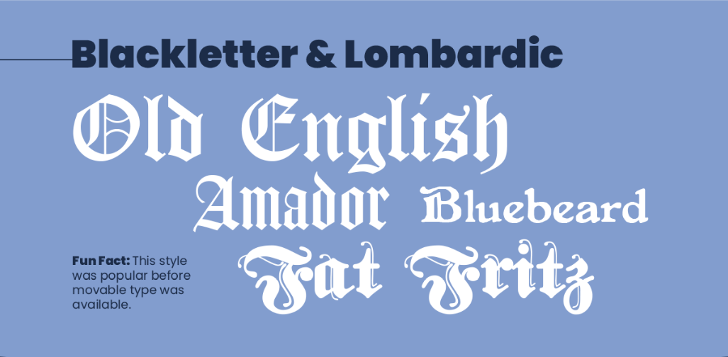
This style was popular before movable type was available, which means it’s also one of the oldest styles. It’s so old, in fact, that it was created before movable type was invented.
Fonts in this class include:
- Old English
- Amador
- Bluebeard
- Fat Fritz
4. Decorative fonts
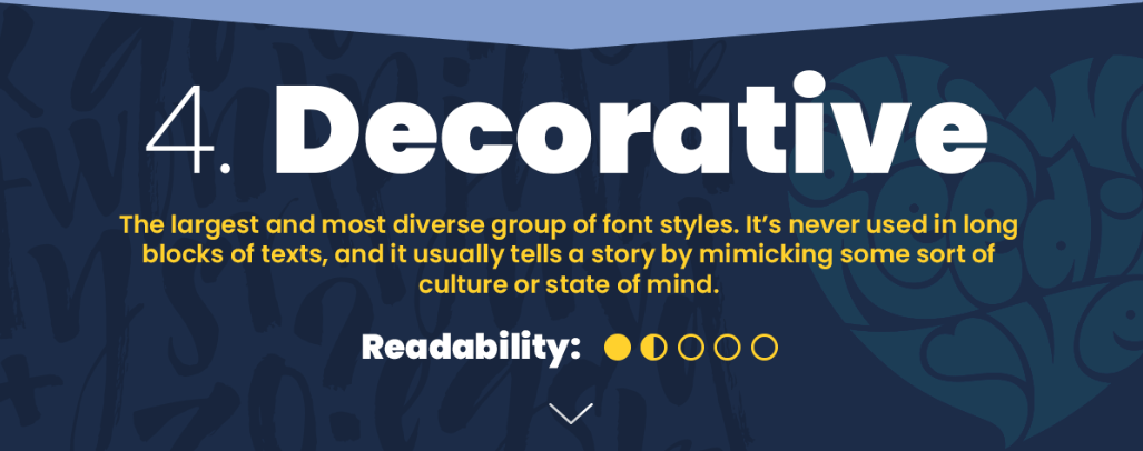
This class of fonts is the largest and most diverse group of font styles. It’s never been used in long blocks of text, since its readability is relatively low. The fonts in this class typically tell a story by mimicking some sort of culture or state of mind.
Grunge
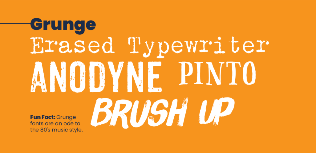
The Grunge style is an ode to the 80s music style that took the world by storm. The rough and bumpy edges give an underground feel, but the fonts in this group are some of the most readable in the decorative class.
Fonts in this class include:
- Typewriter
- Anodyne
- Pinto
- Brush Up
Art Deco
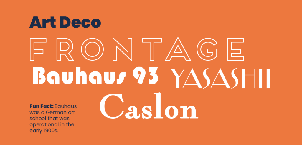
The Art Deco group of fonts pays homage to (surprise!) the art deco era. Bauhaus was a German art school which was operational in the early 1900s — which shows the artistic influence on these fonts.
Fonts in this class include:
- Frontage
- Bauhaus 93
- Yasashii
- Caslon
Graffiti
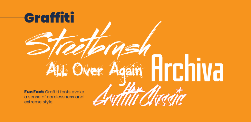
This style evokes a sense of carelessness and extreme style — much like actual Graffiti on the walls of city buildings. This group can be extremely hard to read, so it’s never used in body copy, but much rather for design purposes.
Fonts in this class include:
- Streetbrush
- All Over Again
- Archiva
- Graffiti Classic
Great fonts make great designs
With so many different fonts, it’s easy to see how you can use them to express different feelings, ideas, and tones. Fonts are a huge part of design, and at WebFX, we have a whole team of web design experts that are all too familiar with fonts and the way they can make or break a website.
If you’re interested in a custom website that features fonts that speak to your brand and message, feel free to contact us online, or give us a call at 888-601-5359 to speak with a specialist!
The post Web-Safe Fonts for Your Next Design Project [Infographic] appeared first on WebFX Blog.