
Others
Simplistic Website Design Ideas to Transform Your Online Presence

Apr
Here’s a great article from WebFX Blog
Your web design is typically one of the first interactions potential clients have with your brand. First impressions are key, and your website is your chance to make a lasting first impression on users.
With over 1 billion websites on the Internet (and growing by the second), your website has to stand out among the rest, especially if you want users to love, trust, and return to your brand. But how do you stay inspired and craft a website unlike any of the other billion out there?
Today, well talk about various web design ideas that you can tweak and manipulate in order to concoct a design for your perfect website.
Can’t build a website on your own? Don’t worry, WebFX can help. We offer web design and development services for tons of industries. Find some inspiration here, decide on elements that you like, and bring your blueprint to us.
Now let’s get started!
Simple website design tips
When it comes to your website, simple is better. The more site elements you have, the more potential there is for overwhelming users, which could cause them to leave your website.
Here are some tips for keeping your web design simple, crisp, and aesthetically pleasing.
Keep your navigation simple
Your navigation bar is one of the most important elements of your website. Not only does it give site visitors an overview of what your website has to offer, but it also helps them navigate effectively.
Sometimes though, companies will cram all their site pages into their main navigation bar. Although this seems like it might be the best way to show users all of your site pages, it can easily overwhelm viewers and do more harm than good.
If users become too overwhelmed by your navigation bar and have to sift through tons of pages before they can find what they’re looking for, they might navigate away from your page.
Your main navigation should feature four to six main tabs with a few options under each. This will ensure that your users have enough choices to direct their interests, but not too many to overwhelm them.
Don’t use too many colors
If you use too many colors on your site, you could again leave users feeling overwhelmed. It’s one thing to have a core color palette with a few main colors, but when you use them all at once on your site, it won’t bode well for your design.
You should try to stick to two or three main colors on your website, not including black and white. From there, use the other colors in your core palette to accent elements of your page.
For example, you could use one of your louder colors for a call-to-action (CTA) button or use a second accent color for your sidebar.
Another important thing to remember with color is to choose a core color palette and stick to it. Using the same colors on all pages of your site will help to boost your brand awareness and help every page feel cohesive, even if they’re designed differently.

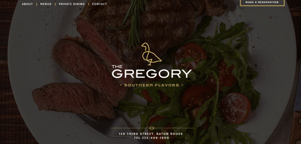
Take this page for example. Between the images, the promotions, and the header, there are so many colors that it definitely has potential to overwhelm users. In just this top section of the home page, there are over six colors.
Relish white space
White space is one of the most important parts of a great web design. Not only does it allow page elements to breathe, but it keeps visitors from becoming overwhelmed by too many site elements.
White space refers to the gaps of space left between site elements, along the borders of your pages, and in between content. Without white space, your pages tend to feel crowded to users.
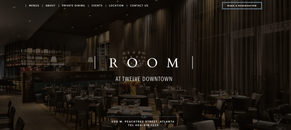
This website does a great job of utilizing white space to ensure that visitors can easily make their way through the page and its content. Scroll through this restaurant website’s homepage to see what we mean!
Simple website design ideas to inspire your next web design
Now that you know a few key elements that help keep your site design clean and simple, check out some of these amazing, modest website design examples that will inspire you to redesign your own online presence.
Warby Parker
Warby Parker, an online eyeglass company, does a great job at showing users exactly what they sell right off the bat, without overwhelming them with information.
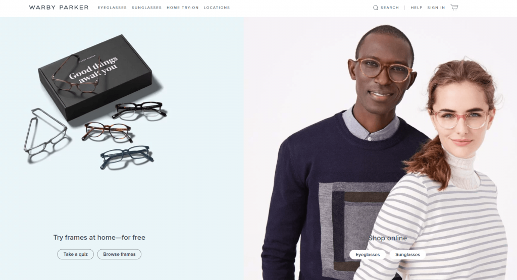
Their homepage is short in length and features less than 100 words, including their brand name and navigation. This simplistic design presents little information up front, prompting site visitors to click around to find what they’re looking for.
But just because there isn’t a lot of information on the home page doesn’t mean users will navigate away.
In this case, the simplistic design pinholes users into clicking one of the few options that they have in order to find what they’re looking for. This is extremely clever since users won’t feel overwhelmed. They’ll be more likely to click to another page to find additional information about the product they’re looking for.
Rothy’s
The “total game changer” shoe website, Rothy’s, features a core color palette, lots of images, and tons of white space.
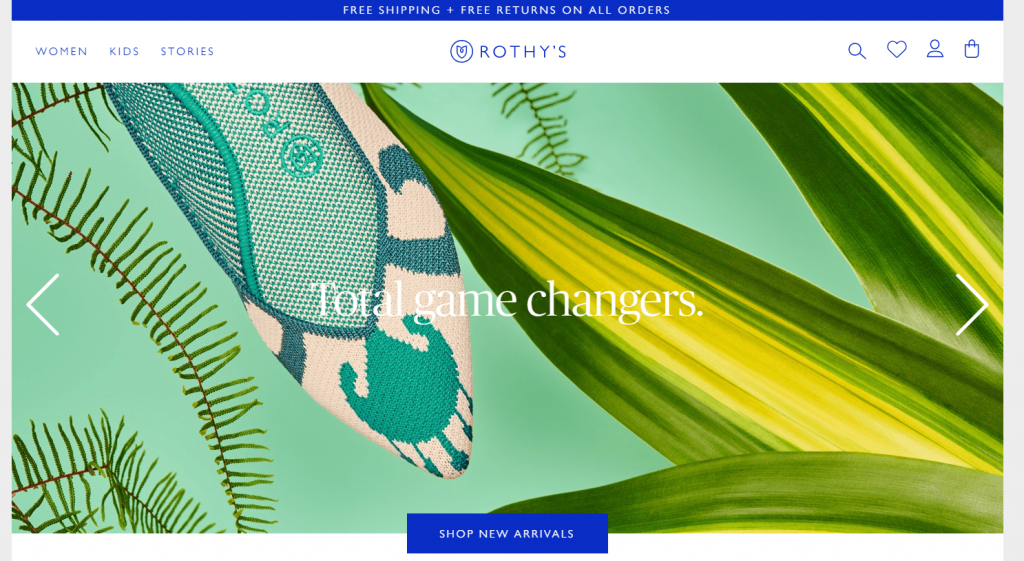
It’s simplistic navigation menu only offers three options — giving users a few choices and a high probability of clicking one of them.
There is ample space between site elements, and though the images are extremely colorful, the site itself sticks to a core color palette of only two colors: royal blue and gray. This allows the images to pop off the page while exciting and engaging site visitors, without overwhelming them.
The Gregory
A fantastic restaurant in Baton Rouge, The Gregory restaurant has a stellar website that is simple, enjoyable, and makes your mouth water for their food.
Their simple home page features six main areas that are backed by gorgeous images of their food and chefs. The color palette features three main colors as to not distract or overwhelm users. The neutral color tone allows the colors of the images to bounce off the page, and white space allows for their page elements to breathe.
They also feature a number of effective CTAs in order to get more information about their target audience or allow them to make a reservation.
Did you know that the amazing designers at WebFX created this website? It’s true!
Want more web design inspiration?
If you’re looking to jazz up your current website or start from scratch, WebFX is here to help! We’ve been creating gorgeous, effective, and enticing websites for clients just like you for over a decade. We can also provide you with web design ideas to help you get a better feel for what you’re looking for.
In that time, we’ve won over 50 awards for our designs and pride ourselves on our full in-house team of some of the most talented web designers in the world.
If you’re looking to create a website that entices users to purchase your products and keep coming back for more, contact us online today or give us a call at 888-601-5359!
The post Simplistic Website Design Ideas to Transform Your Online Presence appeared first on WebFX Blog.