
Others
Create a Toggle Switch in React as a Reusable Component
Here’s a great article from SitePoint
In this article, we’re going to create an iOS-inspired toggle switch using React components. By the end, we’ll have built a simple demo React App that uses our custom toggle switch component.
We could use third-party libraries for this, but building from scratch allows us to better understand how our code is working and allows us to customize our component completely.
Forms provide a major means for enabling user interactions. The checkbox is traditionally used for collecting binary data — such as yes or no, true or false, enable or disable, on or off, etc. Although some modern interface designs steer away from form fields when creating toggle switches, I’ll stick with them here due to their greater accessibility.
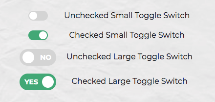
Here’s a screenshot of the component we’ll be building:
Getting Started
We can start with a basic HTML checkbox input form element with its necessary properties set:
<input type="checkbox" name="name" id="id" />
To build around it, we might need an enclosing <div> with a class, a <label> and the <input /> control itself. Adding everything, we might get something like this:
<div class="toggle-switch">
  <input type="checkbox" class="toggle-switch-checkbox" name="toggleSwitch" id="toggleSwitch" />
  <label class="toggle-switch-label" for="toggleSwitch">
        Toggle Me!
  </label>
</div>
In time, we can get rid of the label text and use the <label> tag to check or uncheck the checkbox input control. Inside the <label>, let’s add two <span>s that help us construct the switch holder and the toggling switch itself:
<div class="toggle-switch">
  <input type="checkbox" class="toggle-switch-checkbox" name="toggleSwitch" id="toggleSwitch" />
  <label class="toggle-switch-label" for="toggleSwitch">
    <span class="toggle-switch-inner"></span>
    <span class="toggle-switch-switch"></span>
  </label>
</div>
Converting to a React Component
Now that we know what needs to go into the HTML, all we need to do is to convert the HTML into a React component. Let’s start with a basic component here. We’ll make this a class component, and then we’ll convert it into hooks, as it’s easier for new developers to follow state than useState:
import React, { Component } from "react";

class ToggleSwitch extends Component {
  render() {
    return (
      <div className="toggle-switch">
        <input
          type="checkbox"
          className="toggle-switch-checkbox"
          name="toggleSwitch"
          id="toggleSwitch"
        />
        <label className="toggle-switch-label" htmlFor="toggleSwitch">
          <span className="toggle-switch-inner" />
          <span className="toggle-switch-switch" />
        </label>
      </div>
    );
  }
}

export default ToggleSwitch;
At this point, it’s not possible to have multiple toggle switch sliders on the same view or same page due to the repetition of ids. We could leverage React’s way of componentization here, but in this instance, we’ll be using props to dynamically populate the values:
import React, { Component } from "react";

class ToggleSwitch extends Component {
  render() {
    return (
      <div className="toggle-switch">
        <input
          type="checkbox"
          className="toggle-switch-checkbox"
          name={this.props.Name}
          id={this.props.Name}
        />
        <label className="toggle-switch-label" htmlFor={this.props.Name}>
          <span className="toggle-switch-inner" />
          <span className="toggle-switch-switch" />
        </label>
      </div>
    );
  }
}

export default ToggleSwitch;
The this.props.Name will populate the values of id, name and for (note that it is htmlFor in React JS) dynamically, so that you can pass different values to the component and have multiple of them on the same page. Also, the <span> tag doesn’t have an ending </span> tag; instead it’s closed in the starting tag like <span />, and this is completely fine.
The post Create a Toggle Switch in React as a Reusable Component appeared first on SitePoint.